In the wake of the Brexit Referendum a few people vented their frustration that people should have to show a basic competency with the electoral system, with various media anecdotes.
That may not be such a good idea folks. Aside from fundamental constitutional democratic principles that should not be messed with, you might get a shock about the specifics.
As well as anecdotes of uniformed voters, there is some quantitative evidence of peoples ability to carry out basic democratic functions, rejected votes- the ability to successfully put a cross in one box (and one box only).
Across the U.K. rejected votes are a tiny fraction of one percent (about 1 in 1323 votes cast) was rejected, which is nowhere near enough to affect results but given the 33,551,983 total votes cast rejects were common enough to look into.
A typical assumption that votes rejected for not successfully filling out the referendum for would be evenly distributed between the possible answers, but I decided to check. From the official results, at
http://www.electoralcommission.org.uk/__data/assets/file/0014/212135/EU-referendum-result-data.csv
I graphed the percentage of the electorate voting to Remain in the EU compared to the percentage of ballots rejected. If there is no trend, the line should be flat.
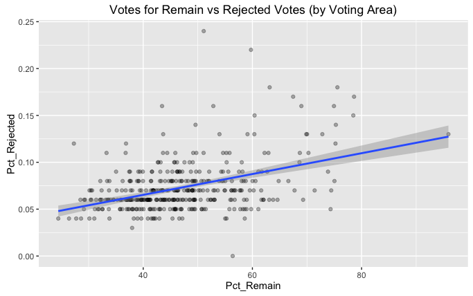
That is not a flat line.
As the percentage of people voting Remain increases, the percentage of people failing to successfully put one cross in one box increases. The natural conclusion of this is that (of the tiny proportion of the population that cannot put one cross in one box) Remain votes are worse at this basic democratic function than Leave voters.
But there is more to it.
As an aside, the 0 rejected votes comes from the Isles of Scilly and is not actually that unusual. With 1424 total votes and a typical rate of rejection of 1 in 1323, it is not that unusual to get zero rejected votes.
Now, the rise that can be seen in the above graph is treating each voting area as an independent, individual group. But if I draw your attention to the London entries

The strong presence of London in the top right high Remain/ high Rejected zone contributes a lot (but not all) to the rising trend. I can see to possible explanations to this which this data is not sufficient to test:
- It is a naturally rising trend, and London happens to fall there because of the Remain vote.
- London is marking votes more stringently, leading to a higher rejection rate. This London based displacement of entries strongly contributes to what seems to be a national trend.
From the data you can’t really tell (at least, I haven’t thought of a clever little distinguishing test yet).
To finish, a bit of R code:
library(dplyr)
library(ggplot2)

euref <- read.csv("http://www.electoralcommission.org.uk/__data/assets/file/0014/212135/EU-referendum-result-data.csv")

ggplot(euref, aes(x=Pct_Remain, y=Pct_Rejected)) +
 geom_point(alpha=0.3) +
 stat_smooth(method="lm") +
 ggtitle("Votes for Remain vs Rejected Votes (by Voting Area)")

sum(euref$Valid_Votes) / sum(euref$Rejected_Ballots)

sum(euref$Valid_Votes)


euref %>% mutate(london = ifelse(Region == "London", "In London", "Not In London")) %>%
ggplot(aes(x=Pct_Remain, y=Pct_Rejected, colour=london)) +
 geom_point(alpha=0.3) +
 ggtitle("Votes for Remain vs Rejected Votes (by Voting Area)")
